Posts

Website Final Design

I must admit that I was pretty intimidated about this project. I’ve never used software for making websites,  and even after having completed this project I still don’t feel completely comfortable with my design skills. To make this project a bit more manageable as well as reduce my anxiety, I tried to stick to my initial sketches as best I could. However, once I started to get the hang of it, I really started to enjoy the process of designing the website. I tried to make it as easy to navigate as possible while keeping things minimalist. I cannot wait to hear what you think and what I could’ve done better.    https://fvazquez214522898.wixsite.com/vazquez-designs .

Final Project Sketches

Image
This is certainly the most ambitious task I’ve undertaken in this digital art class. I was unsure how it would work since I’ve never designed a website, but I did get al to of ideas from looking at some templates on Wix.com. It seems that each vocation and goal has the template that best suits then and their target audience. And considering that I want to showcase my portfolio in this website, I think that going more minimal and simple would be the way to go. This would allow me to not worry too much about the details of the website and focus more on the content and the ease of navigation.  The sketches below show my ideas for the home page, about, contact, and gallery. I’m not sure about the specific color scheme, yet. But I do know that I want to keep it minimalist.  All in all, I think this assignment will be a good test of the skills I’ve learned so far.

Photo Retouching Final

Image
I was unsure how far I would go with this assignment, but I knew that I wanted it to be something that was a bit of a challenge. I had many photos to choose from but they all seemed to have very minor blemishes that could be easily removed. In the end, I decided to work on a photo that not only required me to learn more about Photoshop’s tools, but it also had a lot of meaning behind it. It is a picture of my maternal grandfather. I never met him because he died when my mother was very young, so in essence we both never got to know him. And this picture is one of the only photos that we have of him. The other is a portrait that is in pretty good condition.  This photo has streaks where the photo curled from what I believe was excess heat. Because of these streaks, the image was in pieces so the first step I did was to use the quick select tool to highlight the photo in sections. I separated each selection into its own layer and then I used the move tool to straighten it out and bring t

Photo Retouching Design Brief

Image
 When I read this week’s assignment, I immediately thought about my Mother. She’s the typical mom who loves family reunions as well as organizing photo albums. She has, over the years, gathered a large collection of photos of our immediate family and very extended family.  A lot of the people in her photos she never had the chance to meet, but photos make it feel like she knows them. However, many of subjects in the photos are out of focus or blurry or damaged due to poor storage conditions. This project gives the opportunity to not only complete schoolwork but I can also do something nice for my Mom by restoring an old photo of hers. My hope is that restoring an old photo will make her feel that much closer to her family. She gave me a few photos to choose from which are located below. I’m not sure which I will end up restoring so I hope to hear from you all. Which do you think will be the best to work on? Are some too far gone to be restored? Are some easier to retouch than other?

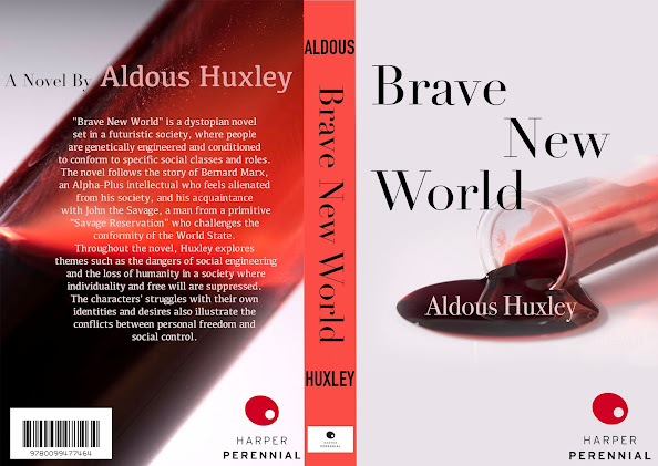
Book Cover Design

Image
 I was tasked with redesigning a book cover for this module, and I decided to pick the one of the best books I’ve read recently, Brave New World  by Aldous Huxley. The book is about a dystopian society, but instead of your straightforward dystopian society where everything is in ruins and the people are oppressed, the complete opposite is true. The people are well-off, have jobs that are tailored made for them, and everyone is open and free to be with everyone else. But Huxley shows that this way of life, although it seems glamorous and utopian on the surface is actually the more realistic way that a society would become dystopian.  I wanted to get at the heart of this book which is all about uniformity, freedom, and fidelity. It’s about being true to the doctrine of “his Fordship” and trying to be one with everyone else. This is expressed in one of their tenets “everyone belongs to everyone else” and the great lengths that they go to to make as many “Bokanovsky” twins. In this age, pe

Book Cover Sketches

Image
I'm very excited for this module's project. I'm sure that many people can relate to the feeling of reading a book that would've been damn-near perfect if it wasn't for the subpar cover design. However, I don't necessarily feel this way about the book I picked (Aldous Huxley's Brave New World ) but it just happened to be the last book that I read. My own copy has a person on the cover with gears and machine parts where a torso and head should be. The mixture of machine and human, along with the religious posture of the person all foreshadow how the society in Huxley's book is run like a Ford manufacturing plant and the religious devotion its citizens have to the government. The minimalist style really emphasizes the person/machine creature. And I don't think that my designs are better but they're hopefully as good. My first book cover sketch highlights the society's obsession with creating people who are a similar to each other as possible bec

Awareness Poster Final

Image
  First things first, I'm sure if you saw my awareness poster sketches you will know that this poster has nothing to do with biofuel, fossil fuels, or electrical power as an alternative to said fossil fuels. However, I happened upon an article this past week (which I will include a link to here , although it has a pay-wall) which I felt compelled to bring awareness to. The environment is still important, but I feel that a lot of people are already aware of the issues facing the environment, and they are either helping or not. But not everyone is aware of the degree to which migrant children are being exploited in the US.  In my research, I found out that these children, some as young as 12-years-old are working in the worst jobs. And many of them are actually crucial to products that we use everyday such as General Mills cereal or autoparts. So I decided to include a cereal that is produced by General Mills and which is familiar to most who have had Cheerios growing up. This cereal